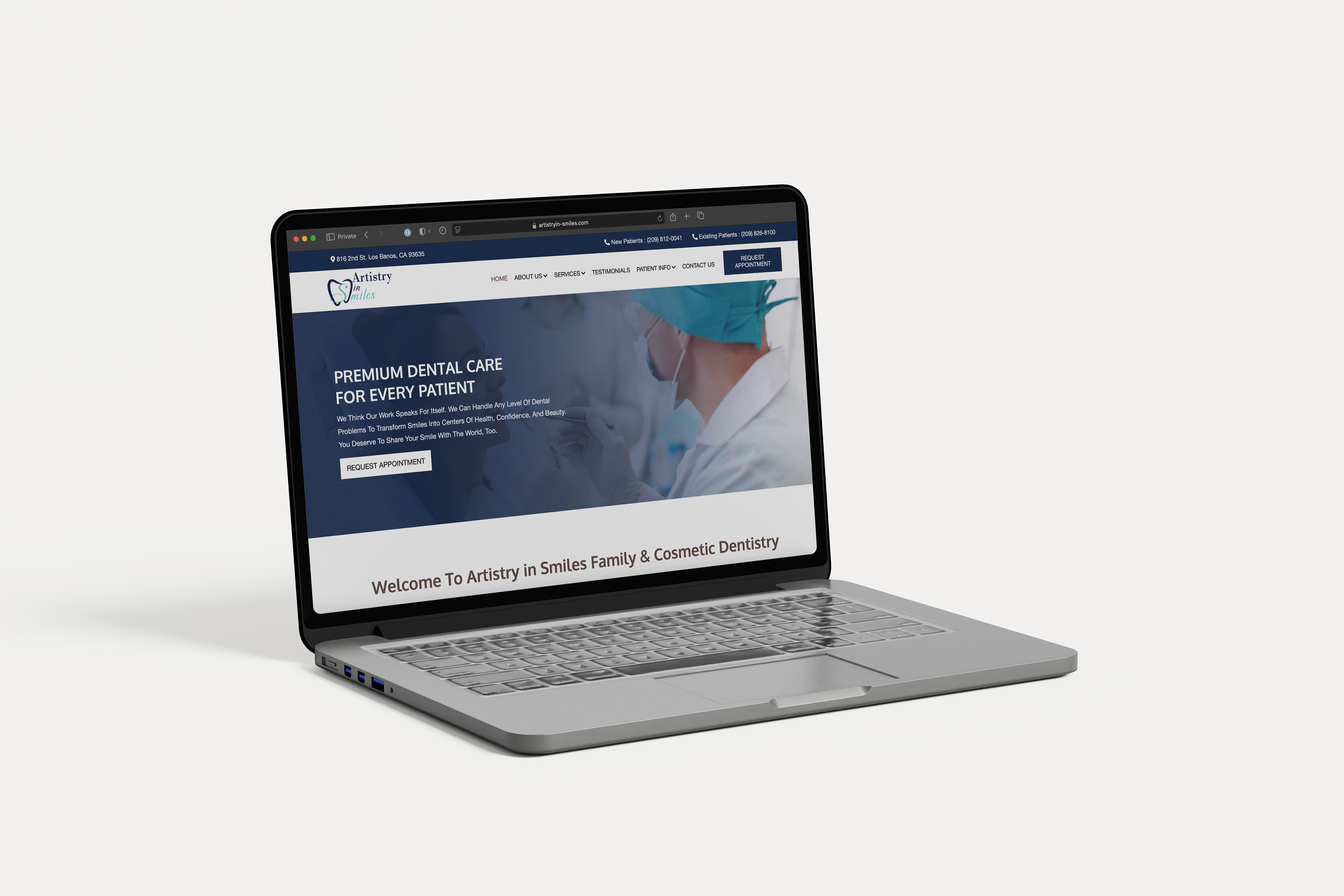
I am the Marketing Specialist at Artistry in Smiles, a fee-for-service dental practice based in California. They underwent a comprehensive rebranding in 2022, including a new website and logo.
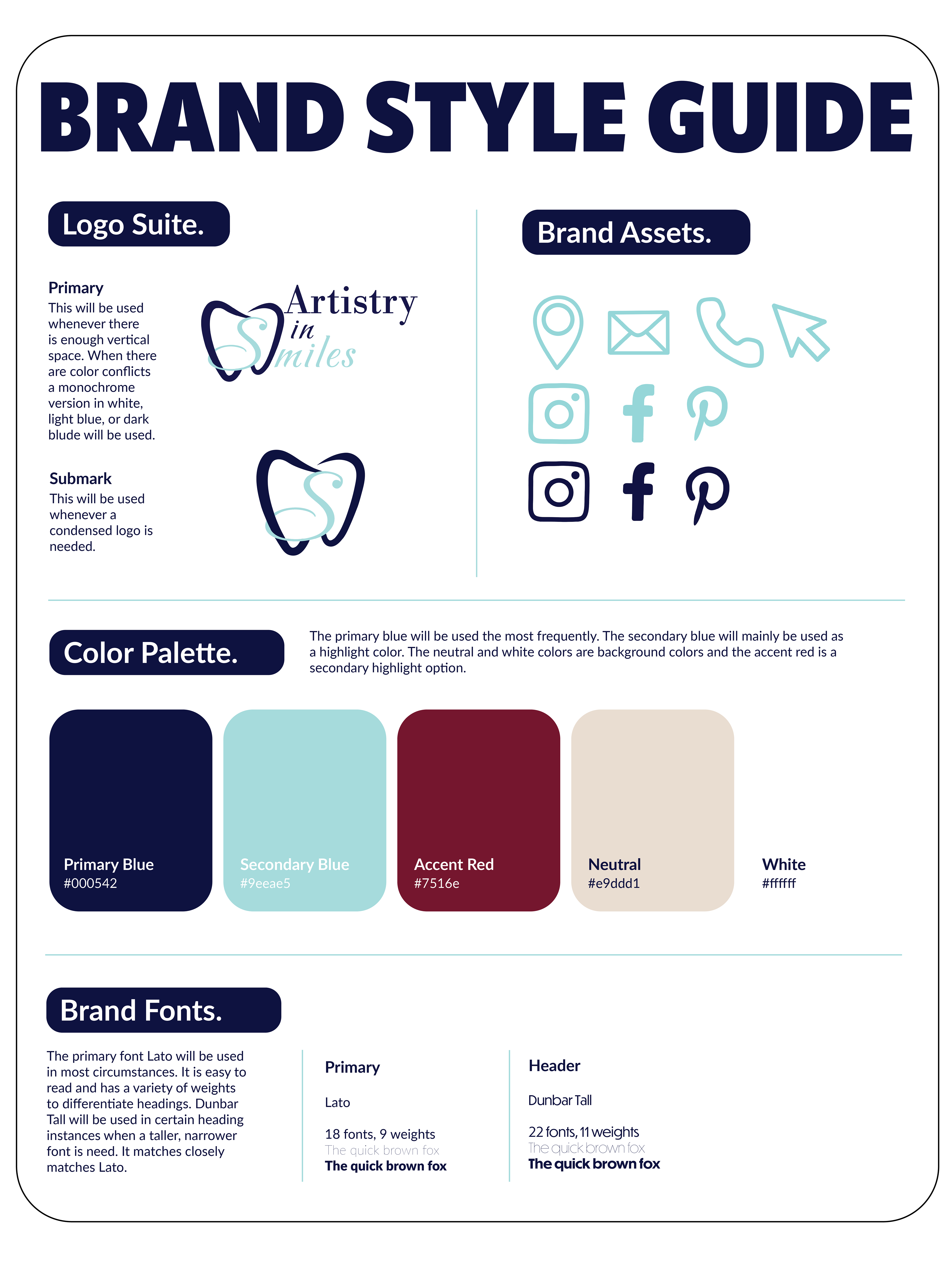
I collaborated with a dental marketing firm to develop the logo. The doctor had a very specific vision, so we eventually provided them with a detailed sketch to capture exactly what he wanted. Drawing from industry color trends, we chose two shades of blue for the logo. While the dark blue was selected quickly, finding the perfect light blue took more time to achieve the desired effect. Once the logo and primary colors were finalized, I created a style guide to ensure brand consistency.
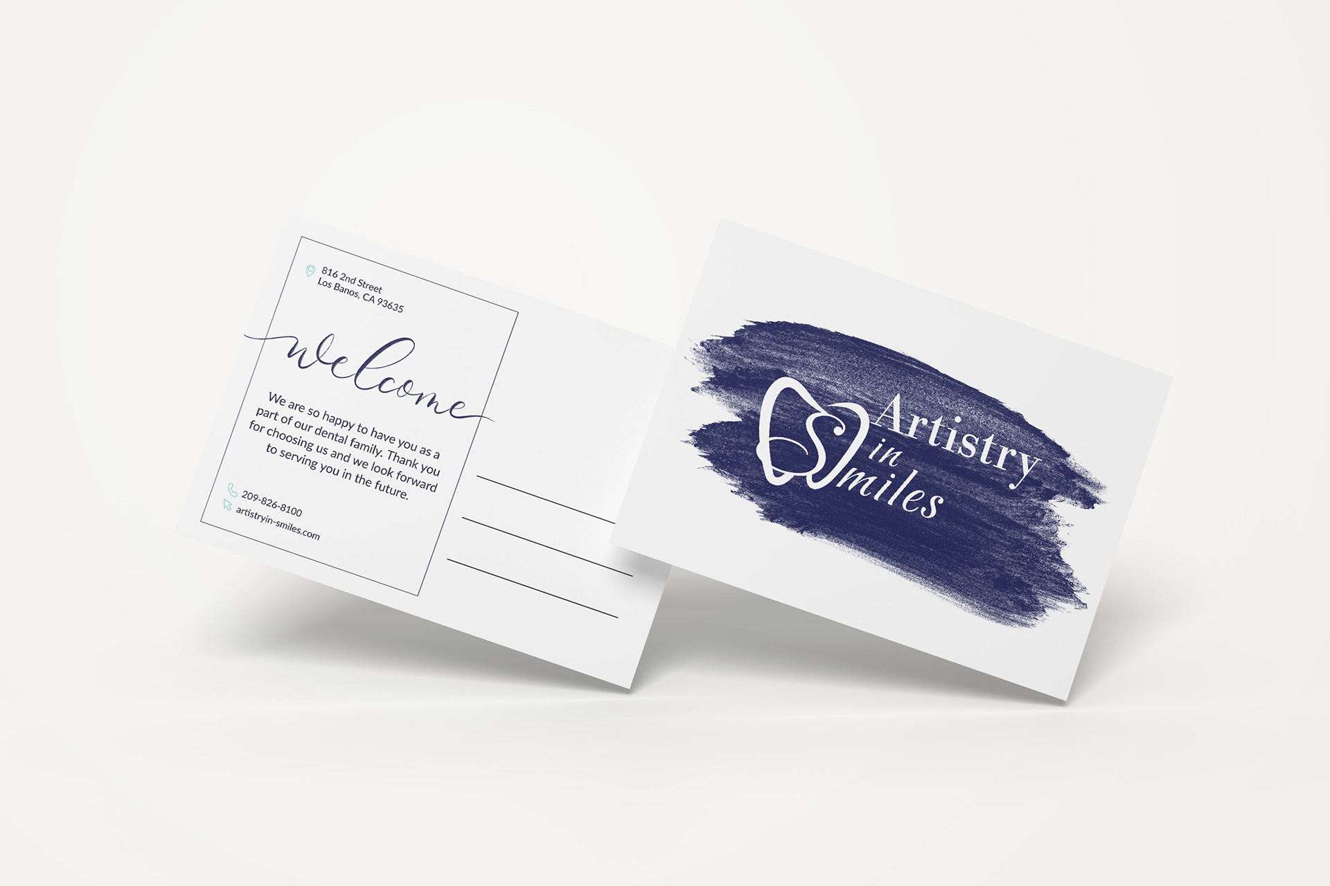
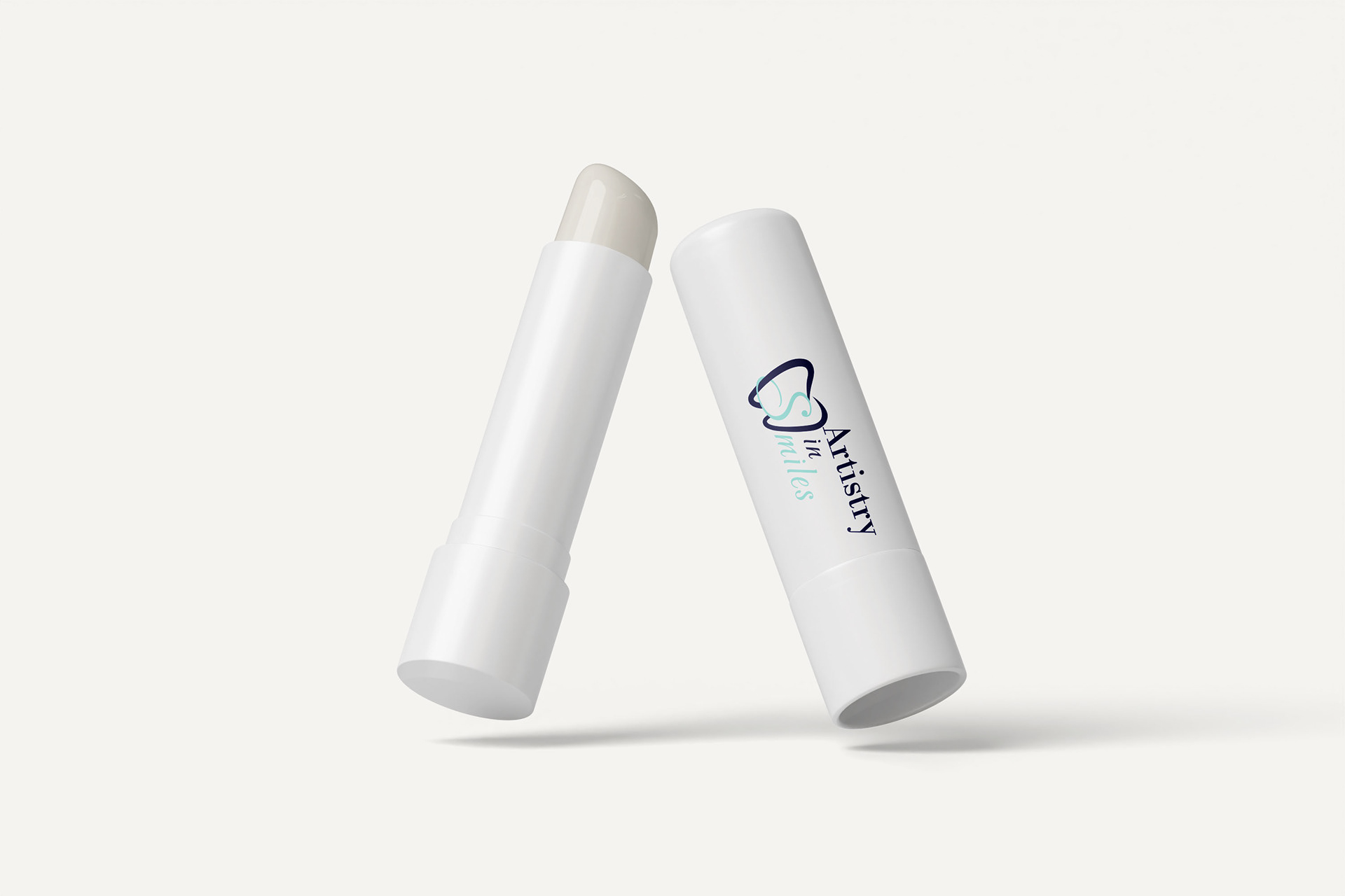
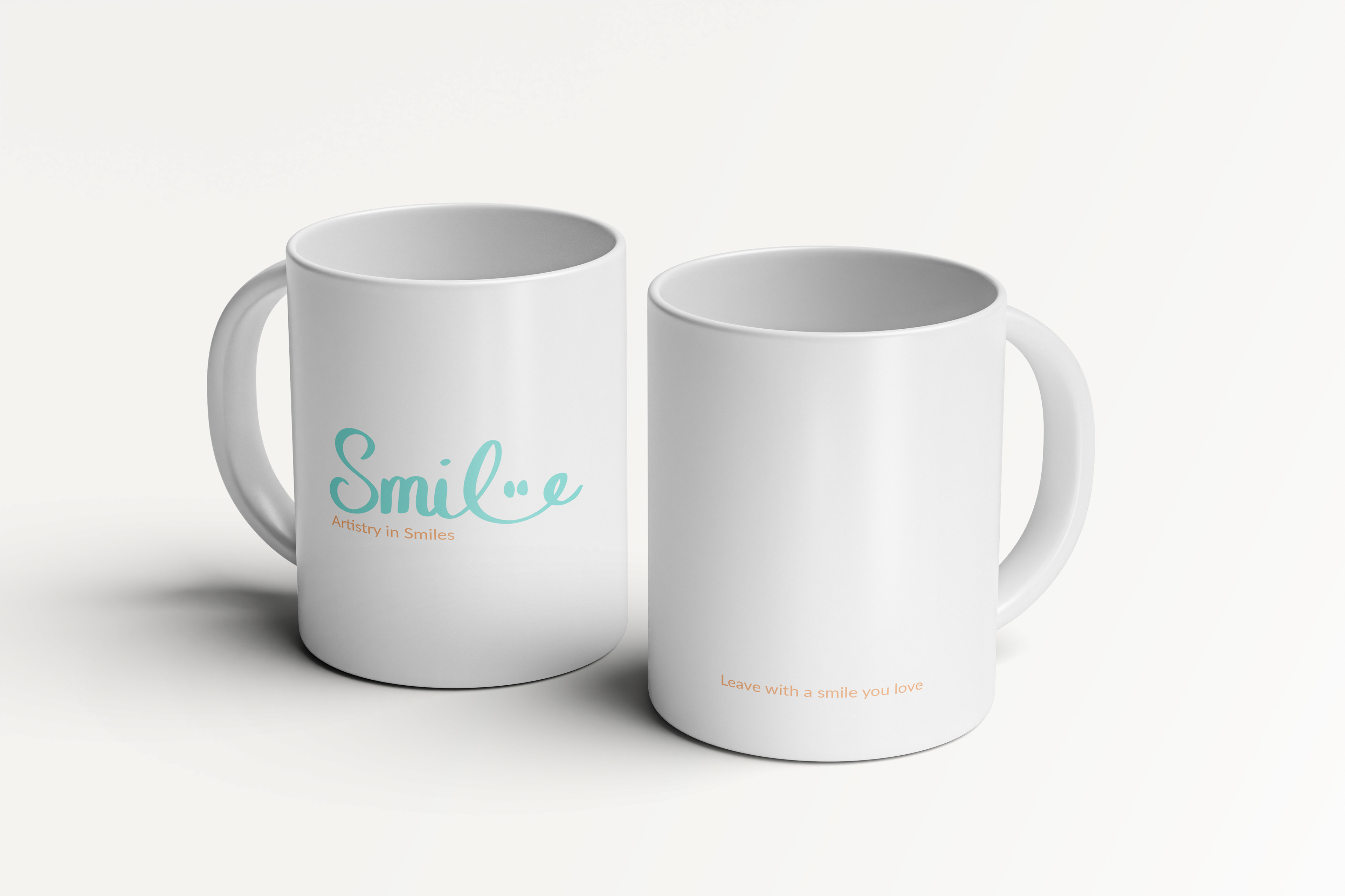
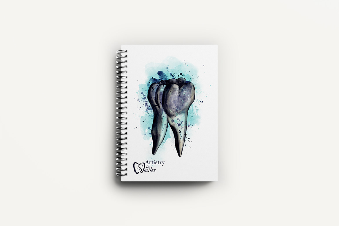
Since then, we have been gradually updating all printed marketing materials to incorporate the new logo and establish a cohesive aesthetic. A signature design element across our branding is an acrylic paint swipe to represent the artistry in dentistry. In 2025, we began rolling out branded merchandise, including notebooks for team members and various products for patients. We offer different levels of giveaways depending on the occasion.
Our marketing content is designed to highlight our unique selling points: cutting-edge technology, a commitment to stand by our work, treating patients like family, and providing after-hours access to doctors. The design elements were carefully chosen to convey quality, professionalism, and comfort. The goal of the designs is to help elevate the brand and differentiate us from competitors.
Our primary target audience is ethnically diverse mothers who schedule appointments for their entire family. We want them to know that we provide comprehensive services for all ages. We have patients who have stayed with us from childhood to adulthood.
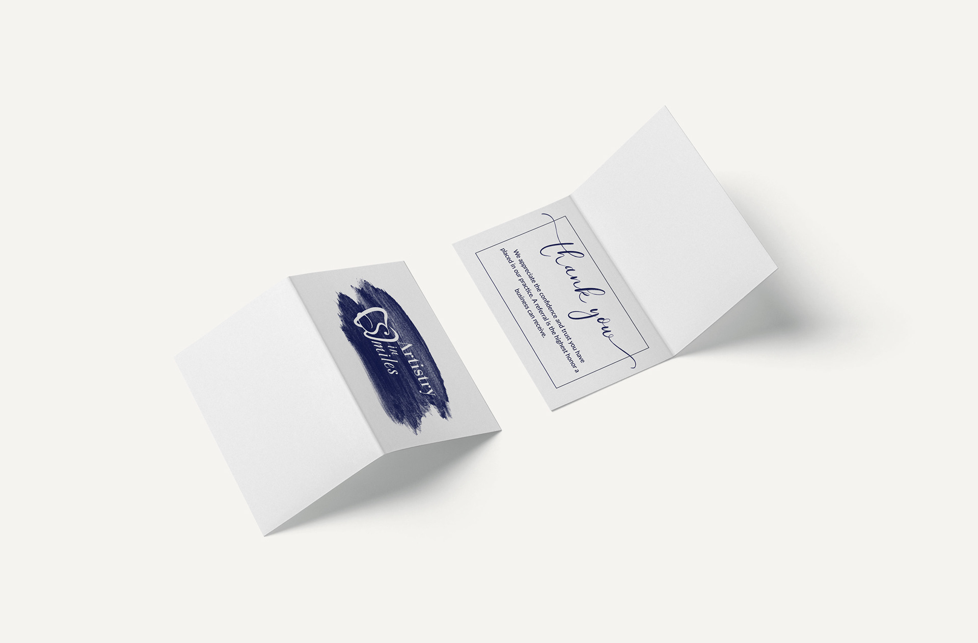
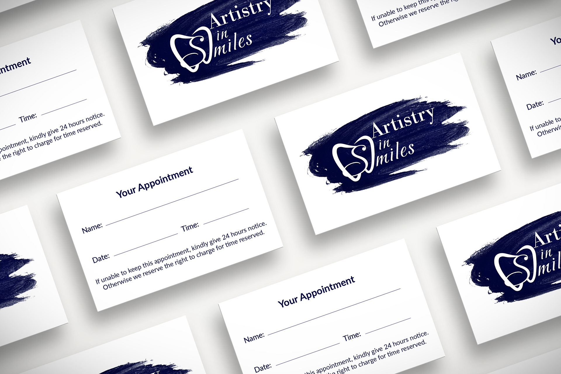
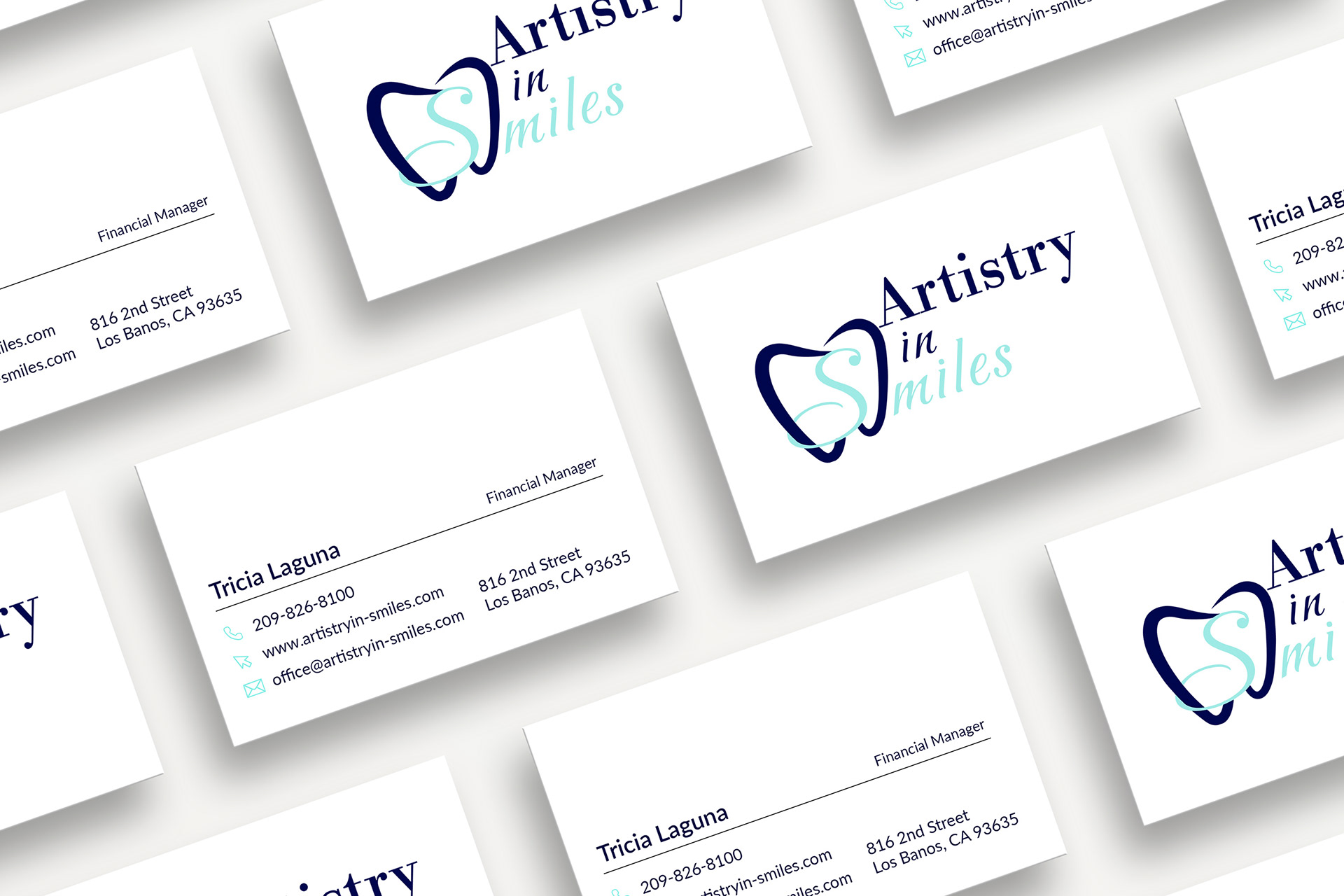
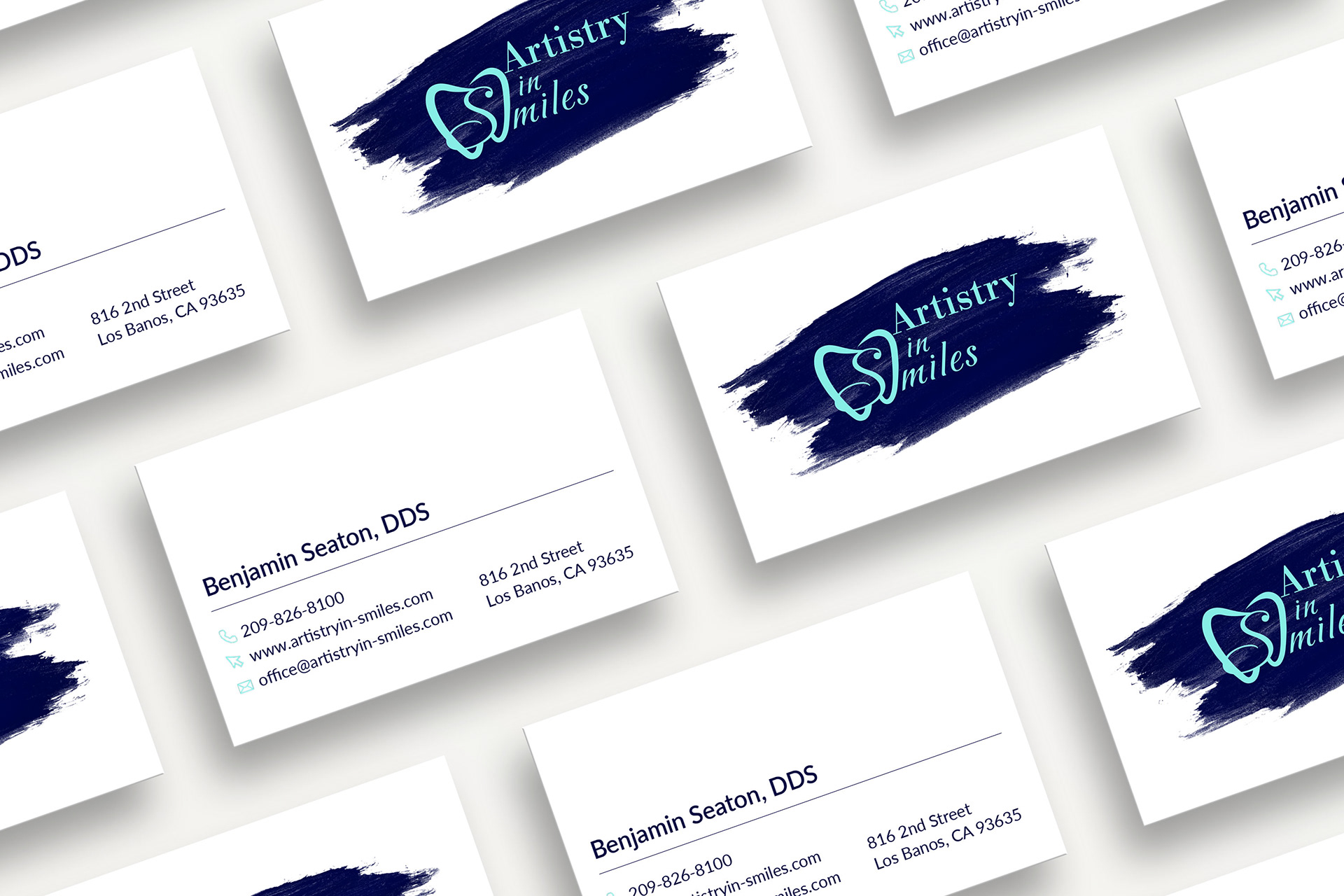
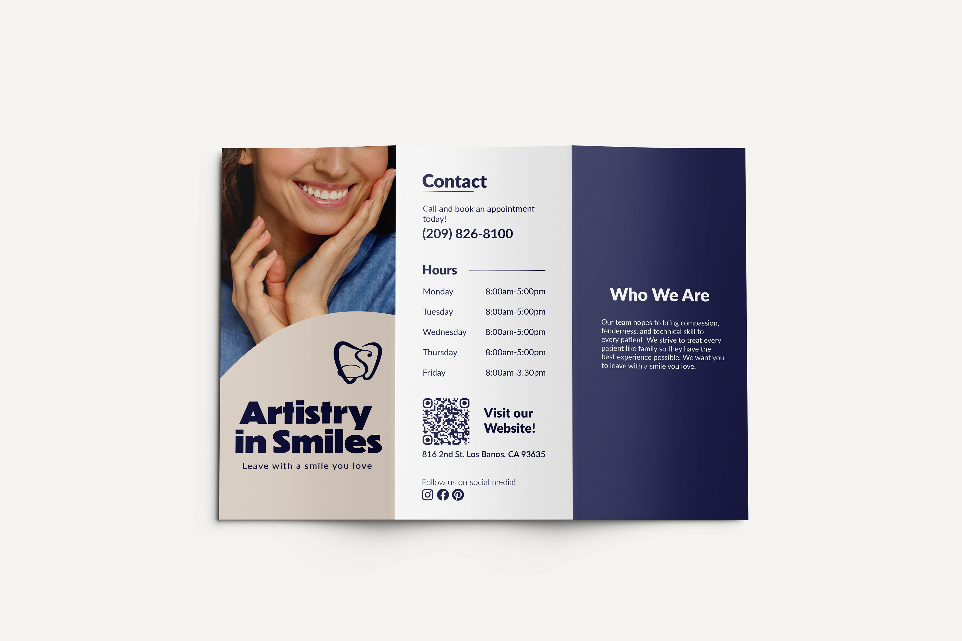
A common concept incorporated throughout the different designs is finding ways to make them easy distinguishable so team members can quickly grab the right one. That is why our light blue color is used in the doctor business cards to separate them from our appointment cards. It is also why are front office manager business card is just the logo. One of my goals when designing was making sure all of the content could easily be incorporated into current workflows at the practice.
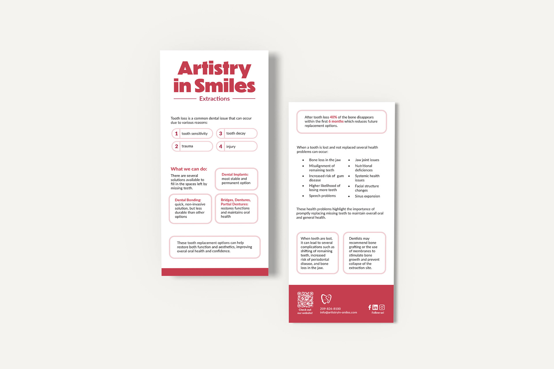
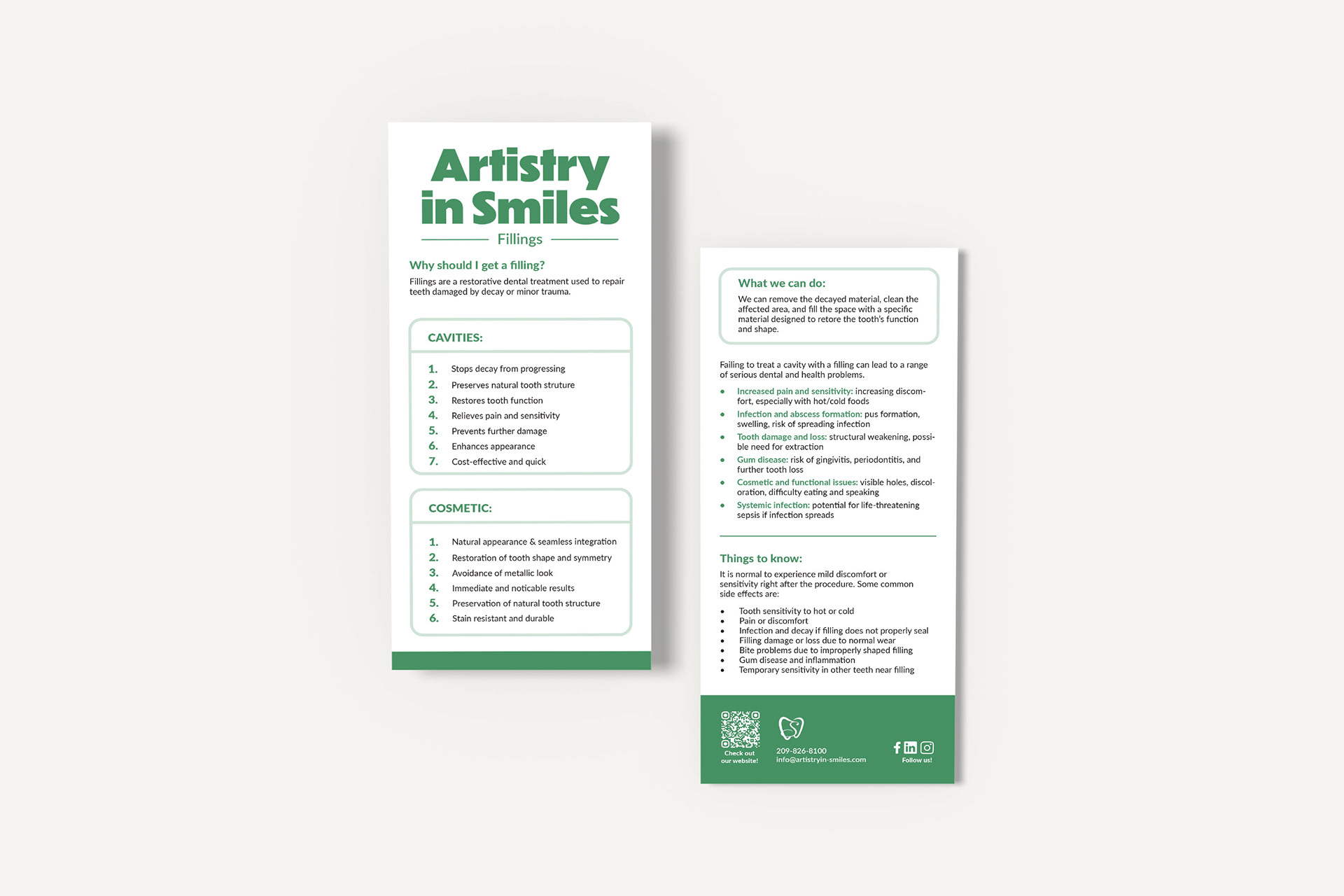
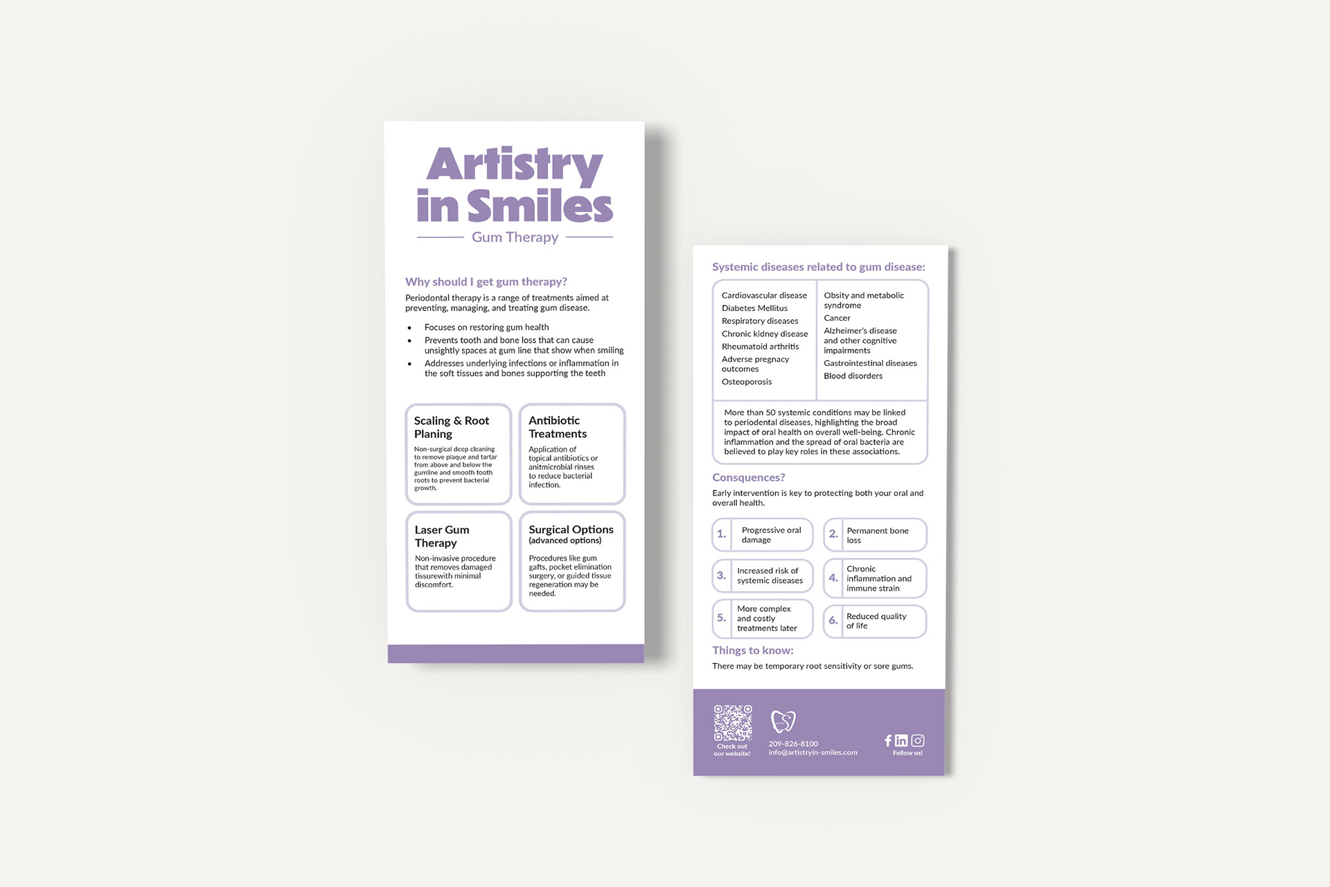
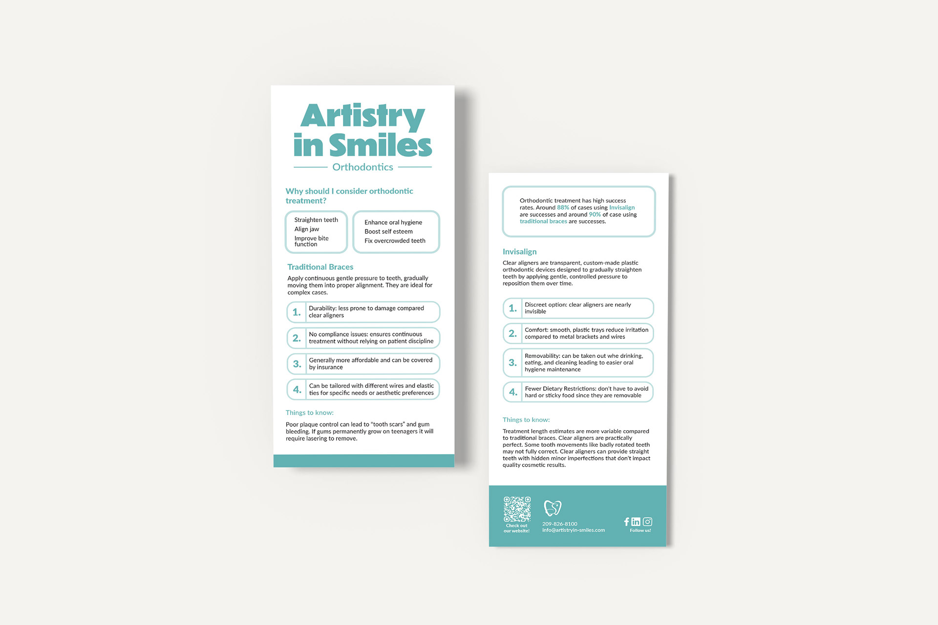
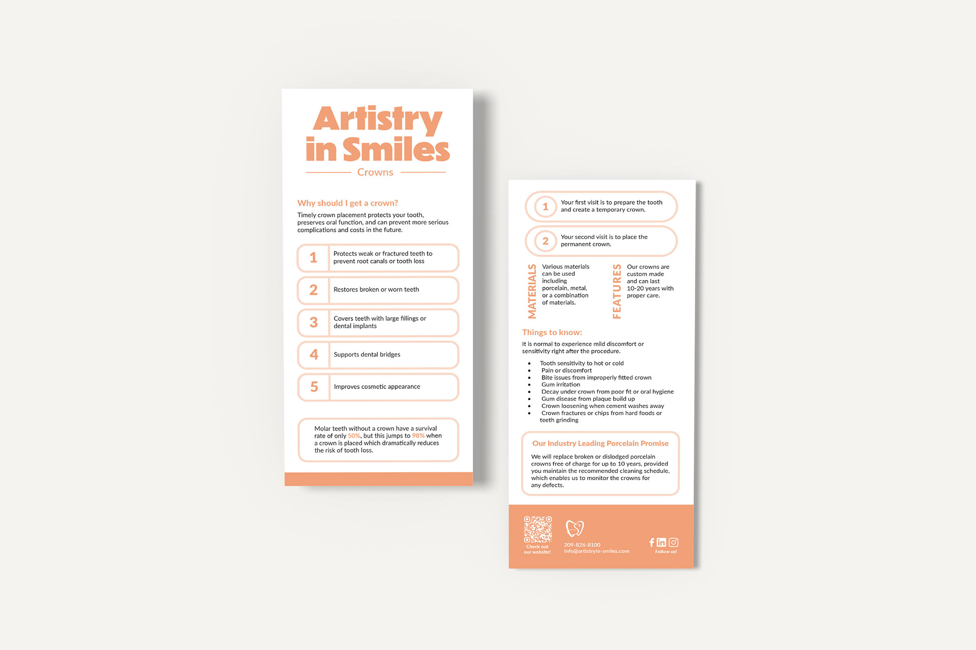
Procedure cards (displayed above) describe our top procedures and are used in the diagnosis process. The cards are each a different color to help dental assistants quickly know which one to grab without having to read them. We want patients to feel comfortable throughout the process from diagnosis to treatment. One of the ways to do that is quality workflows that allow the patient to feel secure in the decisions they are making. Our goal with the cards is to educate and motivate patients. Each procedure card clearly addresses four things: why a patient should get the procedure, why there is a problem, what happens if it isn’t fixed, and any complications they need to be aware of. These cards will be handed to the patient when the doctor presents a procedure to them. They can look it over in the chair and take it home if they would like. One of our top goals in AnS is to find ways to make the customer experience better.
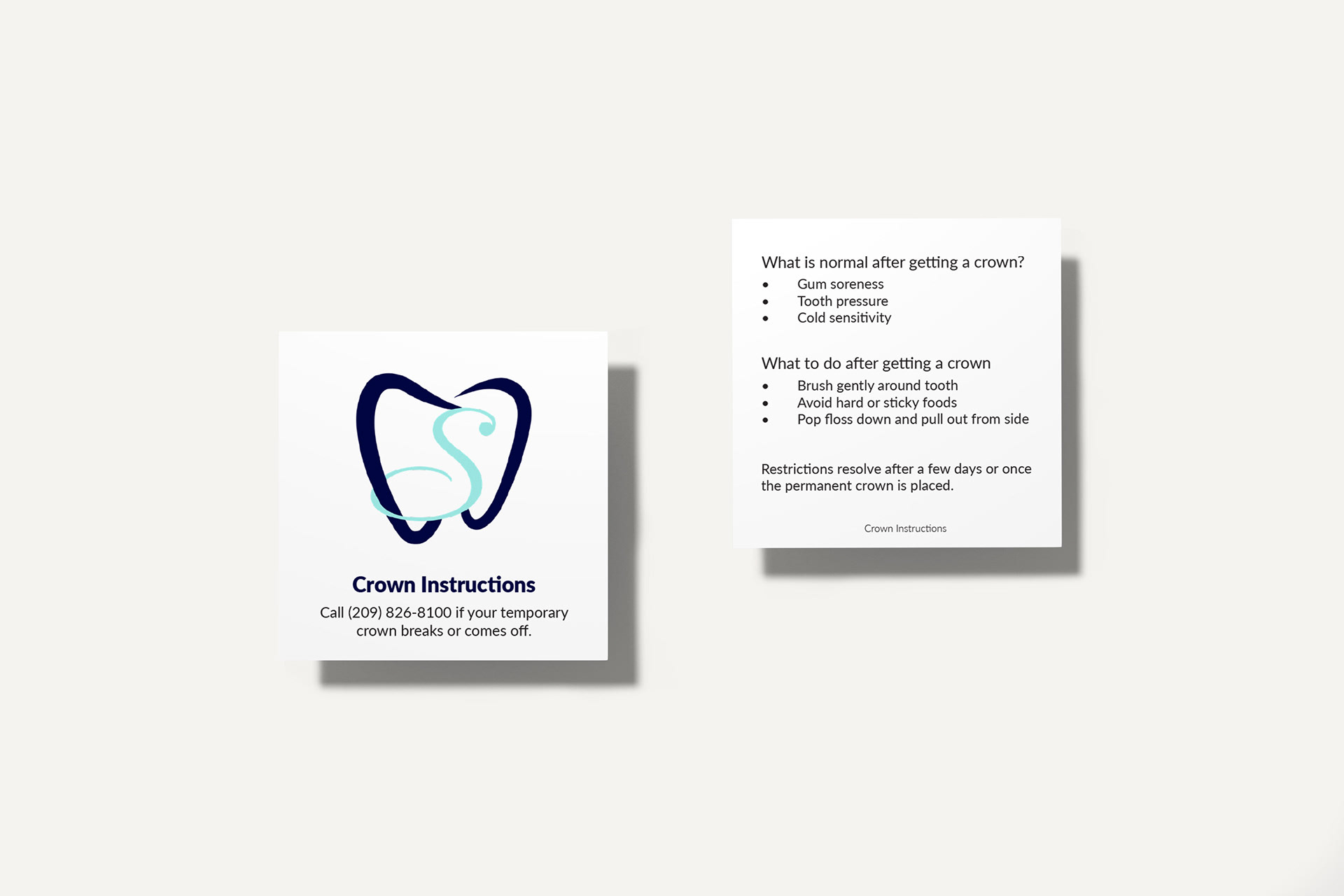
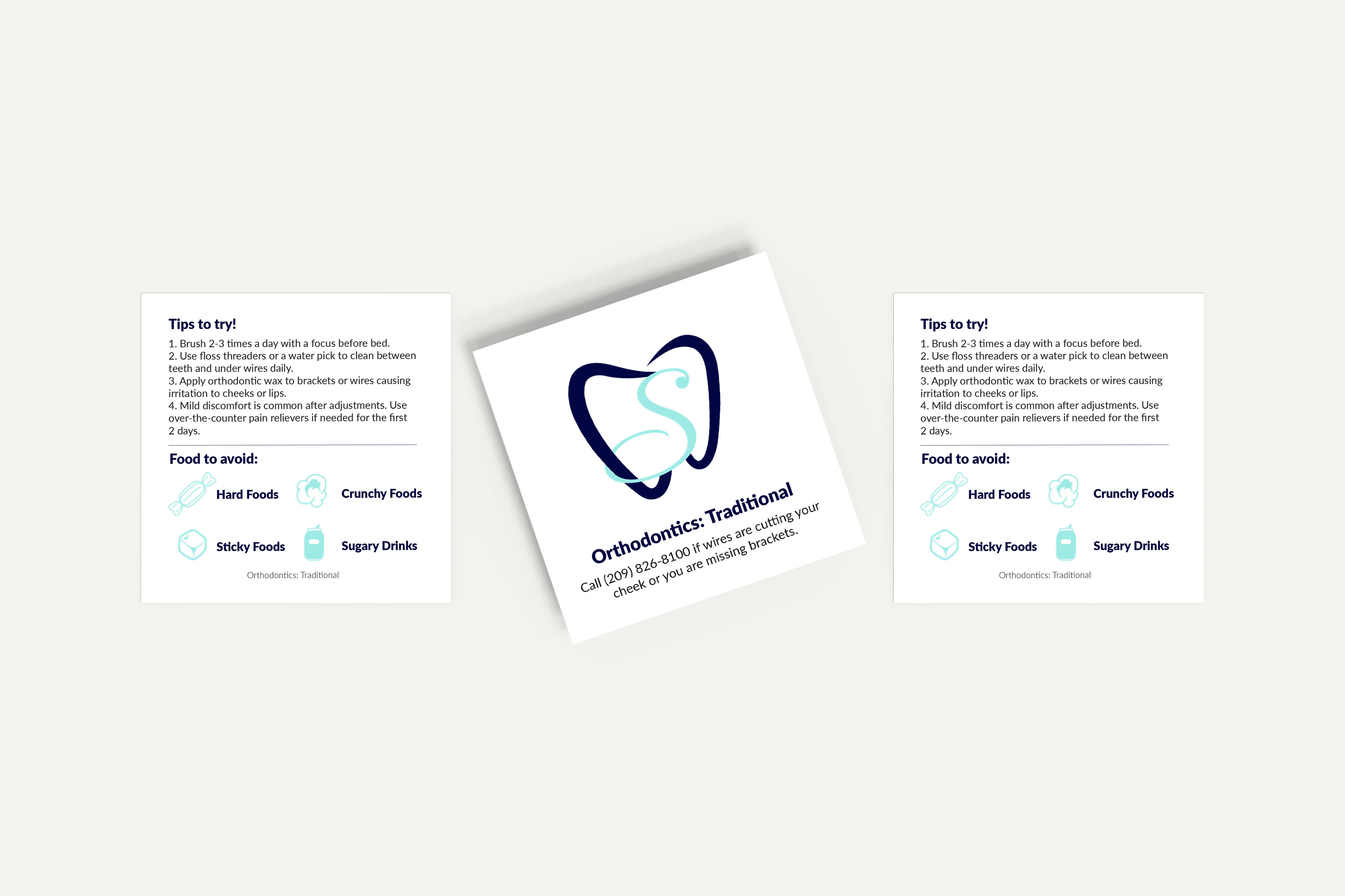
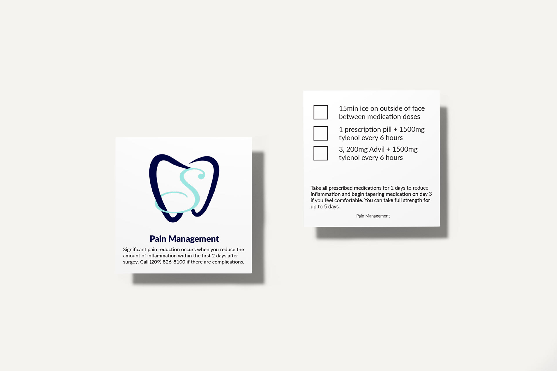
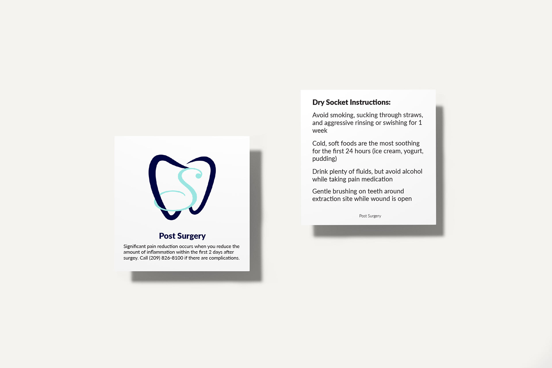
Care cards (displayed above) are a personalized way to present aftercare information. They are square cards that are specific to different procedures. We currently have four versions: crown instructions, traditional orthodontics aftercare, post surgery, and pain management. The pain management card has our three aftercare options. The doctor can then check which one is relevant to the patient when he is going through their aftercare instructions. The care cards also help serve as reminders so patients always feel confident in what they need to do.

I also produced a welcome video for our website featuring interviews with both doctors and our office manager. The goal was to keep it concise while clearly communicating our key differentiators.
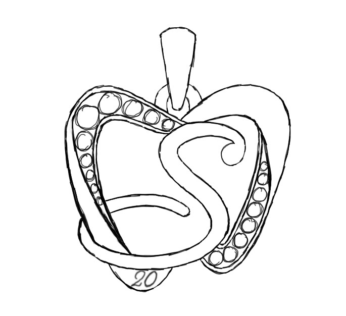
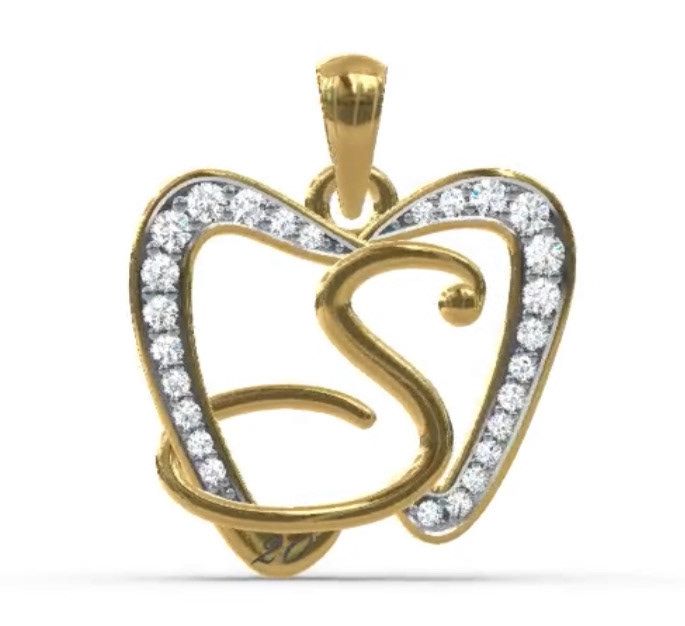
In 2023, two team members celebrated 20 years with Artistry in Smiles. To honor their dedication, the doctor commissioned a special gift of a branded necklace. I created the initial sketch for our jeweler, and after some refinements, the final design was crafted in 14k gold with diamonds.